Chinese YMCA Secondary School
Art direction, photography and brochure design
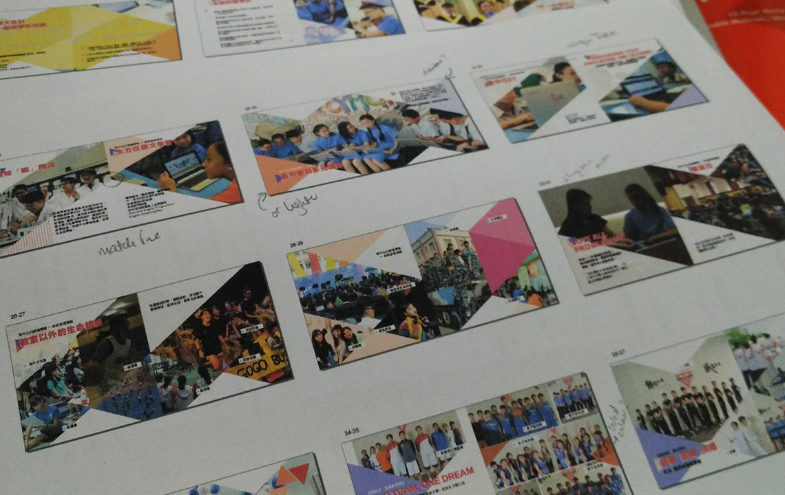
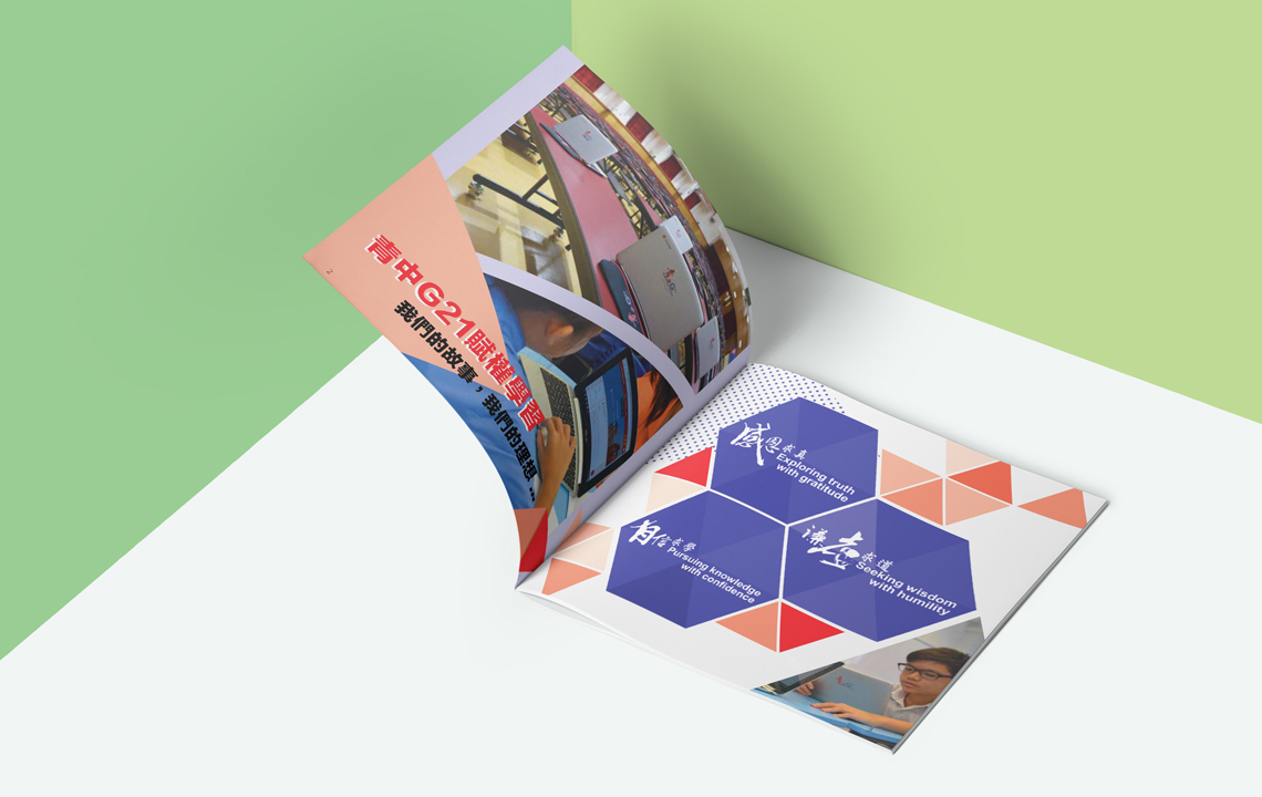
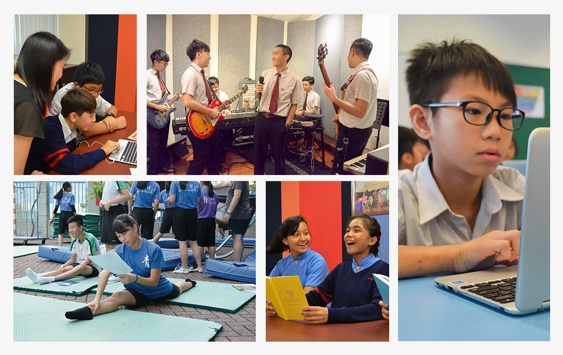
The art direction for the photography put students at the centre of each activity to show the schools huge curriculum and support for individual development in the classroom and on the sportsground. The layout in the brochure continued this idea by introducing a lot of imagery and 'movement' in the pages to attract parents and potential students to join the new school term.
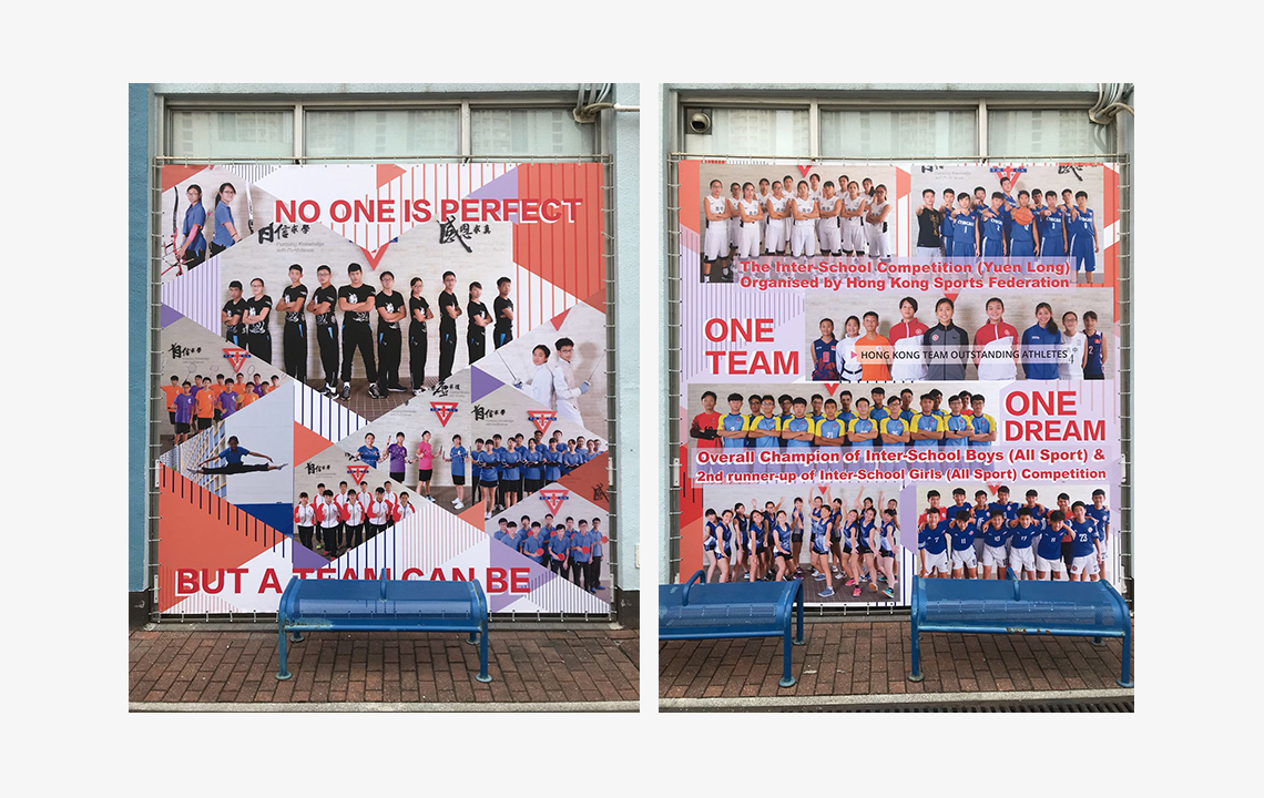
The brochure layout was also used as a guideline to design the large display boards throughout the school.
• Creative art direction
• Photography
• Brochure design and layout


